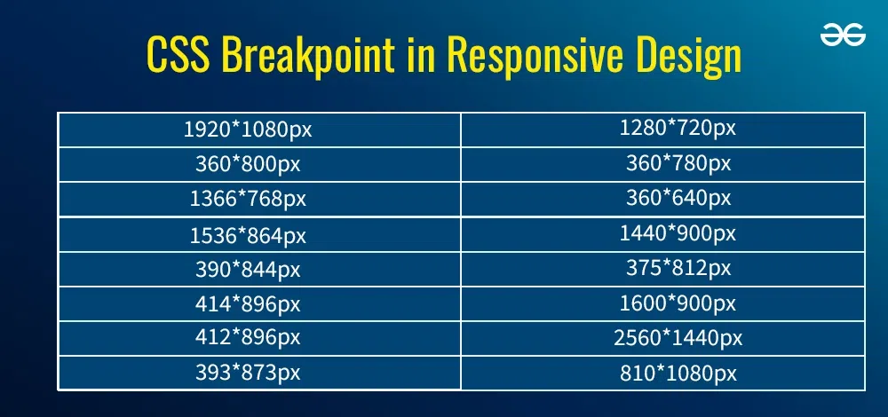
These are the recommended responsive breakpoints used by most modern WordPress themes and page builders:
| Device | Width Range |
|---|---|
| Large desktops | 1440 px and above |
| Laptops / desktops | 1200–1439 px |
| Tablets (landscape) | 992–1199 px |
| Tablets (portrait) | 768–991 px |
| Mobile devices | 360–767 px |
📌 Key rule: Always design mobile-first, then scale up.
WordPress Image Dimensions (2026 Standards)
Featured Images (Hero Images)
- Recommended: 1200 × 628 px
- Aspect ratio: 1.91:1
- Max safe: 1600 × 900 px
Used for:
- Blog headers
- Social sharing previews
- Archive pages
In-Content Images
- Standard: 800 × 450 px
- Aspect ratio: 16:9
For full-width sections:
- 1200 × 675 px
Blog Thumbnails / Cards
- 600 × 400 px (3:2)
- 600 × 600 px (square layouts)
Logos & Icons
- Logos: 300 × 100 px or SVG
- Icons: 64 × 64 px or SVG
Typography Width & Readability Rules
In 2026, readability is driven by line length, not just font size.
Optimal Content Width
- 60–75 characters per line
- Ideal content column: 680–760 px
📌 Wider text blocks reduce reading comfort, especially on desktops.
Gutenberg, Block Themes & Page Builders
Modern WordPress tools respect dimensions differently:
Block Themes (FSE)
- Uses global styles (
theme.json) - Container widths usually: 1200–1300 px
- Excellent consistency across pages
Page Builders (Elementor, etc.)
- Custom breakpoints
- Per-device width control
- Requires stricter design discipline
📌 Always standardize container widths to avoid layout drift.
Image File Size & Performance Targets (2026)
High-resolution screens demand quality—but performance still wins.
Recommended Limits
- Featured images: ≤ 300 KB
- In-content images: ≤ 200 KB
- Thumbnails: ≤ 100 KB
Best Formats
- WebP (preferred)
- JPG (fallback)
- SVG (logos/icons)
Common Dimension Mistakes to Avoid
❌ Designing only for desktop
❌ Uploading 4000px wide images unnecessarily
❌ Mixing too many aspect ratios
❌ Ignoring tablet layouts
❌ Using full-width text without max-width limits
These mistakes lead to poor UX and SEO penalties.
The Ideal WordPress Dimension Setup (2026 Ready)
If you want a safe, future-proof configuration, use this:
- Max site width: 1320 px
- Content width: 720–800 px
- Featured image: 1200 × 628 px
- In-content image: 800 × 450 px
- Full-width sections: 1440 px+
- Mobile breakpoint: 768 px
This setup works seamlessly with modern themes, block-based editing, and responsive frameworks.
Final Thoughts
In 2026, WordPress website dimensions are no longer guesswork—they are a core part of performance, SEO, and user experience. A well-structured layout with correct widths, breakpoints, and image sizes ensures your site looks sharp, loads fast, and scales effortlessly across devices.
By following these standards, you’re not just designing for today—you’re building a WordPress website that’s ready for the future.
Ready to Rank Higher on Google?
MeraSEO’s SEO experts in Mumbai have delivered page-one rankings for 500+ businesses. Our data-driven SEO strategies deliver measurable, lasting results tailored for the Indian market.
Get a Free SEO Audit →

